No Waste! That’s just one of the many great things I love about glass fusing! Even the tiniest piece of glass is usable/fusible.
It takes a lot more glass to build elaborate designs with intricate shapes than it does to build designs with simple square shapes. With the rising cost of material always in mind I want to get as much use out of my sheet glass as possible. Rather than let the cost of material inhibit my creative direction I trust in the process. While fabricating the project at hand I keep an eye out for interesting new design ideas that develop along the way.
Octopus Tray
This flowing octopus design is an amazing example of how to repurpose cut offs. The movement of the tentacles combined with the vivid blue background and painterly quality of the frit make it so fun to build.
When I have a design idea in mind I draw the pattern without limitations. Then I decide on the best fabrication method to achieve the artistic look I want. I enjoy cutting glass by hand with my pistol grip cutter. I actually use my saw as little as possible and save it for deep cuts that would otherwise be impossible. But the ring saw was my tool of choice to get the smooth, graceful shapes I believed would bring this design to life.
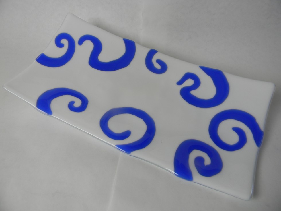
The sweeping glass curls cut from the background of the octopus were prefect for a new complimentary design. I love the octopus tray for its whimsical design and its striking color. It’s a one-of-a-kind and should be appreciated as such. I wanted to created something different with the cutoffs, something equally as exciting and unique.
High Contrast Colors Get Attention
When approaching this piece I felt the distinctive shapes of the dark blue curls would carry the design. All these pieces needed was a simple, uncluttered field to perform their magic. I love the way the sweeping tentacles appear to come from behind and embrace the white glass. It contrasts the Octopus Tray where the design originates in the middle and spreads to the perimeter. The high contrast colors combined with the graceful shapes elevate the elegance of the finished piece of art.
In the future, when you’re looking for inspiration look no further than your scrap bin. There’s a literal gold mine of ideas just waiting to be discovered. Get cutting!
This Octopus Tentacle Tray is the newest project now available with my Premium Video Membership. You’ll enjoy seeing how easy it is to make. Not a member but still love this piece of art? No problem. It’s also available as a single video download.
Happy Fusing!
Lisa & Niki
Follow my blog for weekly inspiration sent to your inbox!
You have choices when it comes to how to fire your projects. Different temperatures will result in different project characteristics. My goal here is to give you the tools to make educated decisions when selecting your firing method so you have greater control and more satisfying results.
Fusing Defined
Fuse:To heat glass pieces in a kiln until they melt together into one piece.
Glass Fusing Process Temperatures
Full Fuse
Full Fuse
Full Fuse 96 COE 1465°F (796°C) 90 COE 1480°F (804°C).Full fuse is the most common firing method. At this temperature the assembled glass project pieces melt together to form one smooth piece with visible, but not tactile, seams. The project has a smooth surface and round, shiny edges. I choose this temperature when I’m making decorative and functional artwork where I want a smooth, uniform surface.
Contour Fuse
Contour Fuse
Contour Fuse: 96 COE 1425°F (774°C), 90 COE 1400°F (760°C).A contour fuse is a fired look between full fuse and tack fuse. At this temperaturethe glass layers are fused, and the edges are soft and rounded. The project surface has both visible and physical texture. I use this temperature when I want to create a decorative project with physical texture that increases the surface area to reflect more light.
Tack Fuse
Tack Fuse
Tack Fuse 96 & 90 COE 1365°F (742°C). At this temperature, the glass pieces stick together. The project edges will be square and shiny. Design elements will retain their texture but are generally not sharp to touch. This is a great temperature for suncatchers and other ornaments where you want a light firing that really sparkles.
Combine Techniques
You can fire a project to a full fuse for the smooth rounded edge quality. Then refire it to a contour or tack fuse temperature with additional design elements on top for a unique and dazzling look.
My Building Process
Most of my work is assembled with the two layers, plus accent method. I refer to the bottom layer as the base and the second as the design layer. The base layer and design layer are the same shape and size. The base layer is often a single piece of clear, but not always; sometimes it’s made up of cut pieces. The second design layer can be a single piece of glass, but often, its pieces fit together to make a specific pattern or design. The third accent layer is minimal, and it usually consists of small fusible elements that enhance the design theme. I choose to build this way because I get consistent results time after time. The finished size and shape of the artwork is predictable. The pieces come out of the kiln with beautiful, rounded edges and a consistent thickness that is both attractive and durable.
It’s All Good
Keep in mind, there’s no single right or wrong way to make any project. Personal preference, design style and function should all play a role in helping you decide which approach is best. The objective is to consciously choose your firing temperature based on a solid understanding of the results.
Excerpt from Glass Fusing Terms as seen on my website.
Summer is a wonderful time to enjoy outdoor activities and breath in the beauty of nature. It’s refreshing to be away from my glass studio in environments rich with color, pattern and new scenes. I cherish time cooling off on the water and the exhilaration of hiking in the woods. The outings clear my mind of old design themes, they rejuvenate my spirit and inspire new design ideas.
I may be off work, but my creative subconscious is on duty collecting tidbits that’ll later be integral parts of my new art. I seek exciting new compositions by studying tiny details like the delicate curled shoots of ferns. I imagine the extreme color combinations studying the broad strokes of a spectacular, cotton candy pink sunset. Even familiar settings, seen with renewed artistic curiosity, offer new appeal.
Fairy Tale Forest from my Painting with Frit Video
Fairy tale Forest was inspired by a path I frequently walk in the woods. It’s an enchanted place with specked shade, inviting curves that promise adventure and the musical sounds of nature alive in the brush. Tall pines and century old oaks form a canopy overhead. The cathedral like tunnel makes me feel small, at ease and safe. It’s as if the trees are guarding me with the wisdom of their age. It’s such a magical place, I half expect to see a white unicorn trotting around palmetto bushes.
The truth is the path doesn’t really look like my design. I exercised my artistic license. I designed the art to convey the way I feel, the comfort and joy I have when I’m strolling down the leaf blanketed trail.
I never would have stretched my artistic vision to that extent without the actual experience of walking down that path.
Paradise Bay from my Painting with Frit video.
Paradise Bay was inspired by a favorite lagoon on a lake. Again, the artwork loosely represents the landscape. It’s really a representation of good times and fond memories of time spent with my family.
River Bottom was inspired by the ditch that lines my street. Really. I was walking one morning and noticed the sunlight shining on the water in the retention ditch on my road. The sun pierced through the clear water down to the bottom where it lit up the tiny green leaves of mossy plants. They sparkled like glitter covered light bulbs. It was so captivating I then noticed some lacy tree leaves suspended in time, and the striking shadows of tree trunks stretching across the placid surface of the water. I thought, this is a beautiful scene, how can I render this in glass?
The project looks simple. You have to see it in person, after hearing the story to really appreciate the true beauty and depth of River Bottom. The take away, the invaluable lesson, is that beauty is all around us. We just have to look for it and then let it inspire us to be creative.
Take it outside!
This summer while you’re exploring beaches, mountains and cities open yourself to discovery. Then, when the artistic spark flares, you’ll have an exciting collection of new ideas to fuel what you fire.
Happy fusing,
Lisa
Follow my blog for more tips and tricks!
Painting with Frit is now available as a download on my website.
For even more tips, tricks and inspiration, Join my Premium Video Subscription and gain access to ALL 45 single project courses today, with new ones added monthly!
A few years ago, I hosted my Sculptural Fused Glass Workshop. We enjoyed 4 incredible full days of creating. The students were awesome! They were excited about learning new techniques and eager to try new ideas.
This class was about producing multiple 3-D glass sculptures that reflected the individual artist’s personal style. To accomplish so many projects in the condensed time-frame I adopted a new accelerated lesson plan. It was a huge success! The students were thrilled with the upbeat pace of the class because it increased the number of projects they were able to make.
On day one they designed, assembled and loaded four different, full-size pieces into the kilns. Plus, they applied different advanced techniques and new design concepts on each of the three pieces.
We kept the quickened pace up all week. The rate enabled the students to make an impressive number of advanced projects, plus custom glass bases. On day two, even I was stunned when I had to re-prime the 11 ceramic kiln shelves we used to fire projects.
Students favorite things about the class included: learning new techniques, making so many projects and my willingness to let themcreate as they saw fit.
We had a few oops we had to overcome.
When working on so many complex projects there’s bound to be some construction issues that come up.
A student realized, before loading the glass in the kiln, that the iridized coating was face down on the flower petals she cut for a floral vase. We wanted the pretty iridized side to show on the outside of the art, not the inside. So, we rearranged the assembly. Instead of building on a clear glass base, we turned the petals over and capped them with the clear. Our results were different than originally planned but equally as nice. Where the iridized red peeked out from under the clear glass the vase rim had a satin shimmer. The variation in shine added detail that was visually attractive in the finished piece of art. Plus, it added a personalized touch to the artwork.
Another student wanted to work with powder frit. His project was accidentally bumped after it was loaded in the kiln. The frit moved causing the pattern to be uneven. Luckily, we saw it before firing the glass. The fix was easy. We simply sifted more powder on top of the uneven pattern and then re-traced the design in the frit. In the end, the repair wasn’t noticeable at all. The piece came out beautifully.
We had a few welcome surprises.
Students were surprised by the amount of glass we used, that they learned how to use saws and the enormous amount of projects completed.
While gluing one of the sculptures together a student and I struggled a bit to get the vertical glass propped up in the position we wanted. We thought we had it. But the next day the glue didn’t hold. Instead of being upright, the fused glass leaned to one side. It wasn’t our intention to make a piece that looked like that. But we decided, unanimously as a class, that we liked the new look. The upside is, we now have a brand new sculptural profile to make in the future.
Even I learned a few things.
When working on this number of projects the variables and possibility for unexpected surprises are increased. The finished results aren’t always what we planned or expected.
I learned that I have to adjust the temperature on one of my kilns. My Free Flow fusing program was firing too hot. As a result, the kiln wash stuck to the back of the fused glass. The higher heat also increased the amount of texture on the back side which reduced the clarity and shine of the glass. Lowering the fusing temperature would increase the clarity and shine on the backside of the glass. The minor adjustment would improve the vividness of the finished pieces of art.
Predictability is an illusion. We like to think we’re in control, but sometimes things don’t go as expected. No matter how much you prepare, plan and practice, you have to be ready for a few glitches.
I’ve slumped over the same custom mold over a dozen times. I thought I knew what to expect. All the parameters were the same. We used the same type of glass, cut the same size, in the same kiln, using the same slumping program. What could possibly go wrong?
The glass didn’t slump! It refused to conform to the fiber blanket mold. I fired it again and held it longer. No luck. I fired it again and increased the temperature by 10 degrees and the hold by 10 minutes. The glass still hovered above the mold.
Then it occurred to me in the middle of the night, when I do all of my major problem solving, maybe I forgot something. Yup, operator error. Sucks right! I didn’t line the fiber blanket with ThinFire fiber paper. It acts as a release that allows the glass to slide down into the mold. And that’s why taking notes is so important, even for seasoned professionals. Write it down and then consult your notes before firing. It saves time, money and frustration.
Lastly, I think I enjoyed the photo shoot of the finished sculptures more than the students. To their credit, it was the end of the last day. They’d been working diligently, stretching their creative minds for 4 full days. It’s no wonder the students were tapped out. They put a lot of energy into making numerous awesome pieces in a short period of time. In total, the three students made more than 20 projects combined! The high res photos are evidence of the impressive work they did.
They came as strangers but left as friends.
Taking a class here is more than just fusing glass. It’s also about building relationships with other glass artists who have similar ambitions, interests and obstacles. Being in class is about showing pictures of your finished work, talking about how to sell your art and sharing solutions to common problems we all have. It’s a real thrill for me to bring different artists together so we can connect and build lasting friendships.
It was a pleasure to work with this group. I was impressed how the students brought their own artistic style and favorite color palate to the projects. I really enjoyed helping them build on their individual strengths to take their artwork to a higher level of complexity.
Wherever you are in your artistic journey you’re doing great! But we can all use a little inspiration now and then to re-spark our creative thinking and expand our skills. It’s artistically rejuvenating to give yourself the gift of knowledge, productivity and of course friendship.
Are you ready for a lift? Join my Premium Video Membership and continue to learn and grow with me!
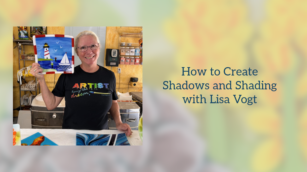
You’re wondering why is this subject important? You’ve likely had success working some element of shading into your pieces and that’s great. However, you may not know about the seldom discussed advanced techniques experienced artists use to produce more sophisticated compositions. With thoughtful planning, you can apply these simple techniques and drastically increase the richness of your work.
When creating shading, it’s natural to reach for black frit or black glass. Black efficiently separates the foreground from the background. Black is also great for outlining your subject. However, there’s a better solution that adds richness to your scene.
When you use black to make shadows it creates a visual hole in your work. This void pulls the viewer’s attention away from your composition. For this reason, I use black as little as possible. I apply it with purpose for specific details in my designs. Instead of black, I use very dark blue, chocolate brown, deep purple or ruby red to make shadows in my pieces. I select the dark color that best suits the color scheme in my artwork. Using powerful high contrast colors adds velvety depth and an incredible richness to the setting.
How to create shadows with color.
Wine Glass as seen in my Simple Pleasures Video
Here I used dark blue to establish the linear details that translate into a grape vineyard behind the wine glass. The deep shadows the blue color creates, give the scene a relaxing late afternoon mood. The border is dark purple which mimics the color of grapes and wine.
Octopus Tray as seen in my Premium Video Membership
Here I used dark red to make shadows on the underside of the octopus tentacles. This application also makes the tentacle visually round and full. Dark red also worked beautifully to outline the octopus body and place it in front of the tentacles that curl behind its body. The only black in this piece is the eye detail.
Fairy tale Forest as seen in my Painting with Frit Video
There’s no black in this lush scene. The dark shadows in the trees and along the path are made with dark blue. The shadow cast on the woodland path is a combination of purple and dark amber frit. Get creative with your color combinations to build up dark recesses that make your highlighted details pop.
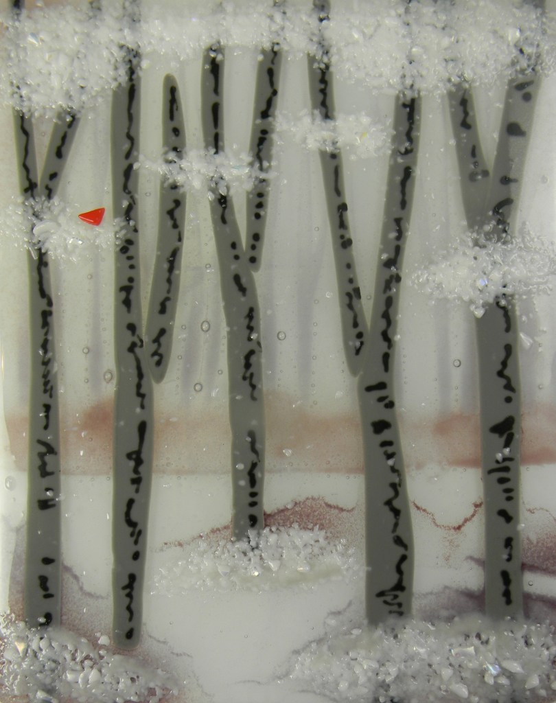
Winter Landscape as seen in the winter issue G.P.Q. Magazine Jan 2023
In this piece of art, black is limited to the lines on the tree trunks. I selected muted tones to create a quiet, calm, and relaxing setting. The shadow under the trees are created with medium purple frit. It simultaneously gave me depth and softness which I wanted to portray in this winter scene.
Welcome Fall as seen in my Premium Video Membership
When making this seasonal piece I wanted to maintain a warm yet rich color palette. I used a small amount black in the word welcome and in some of the letters that spell out FALL. When it came to adding shadows to the pumpkin, I used orange opal frit. The contrast is subtle but effective. I’m pleased with the stylized design and the inviting warmth it adds to my home.
You got this!
Don’t worry about missing black. Once you substitute colors for black, you’ll love the effects you’re able to create. You’ll be amazed how switching to dark colors transforms your art and brings it to life.
Artists take what they see and make it new.
We take an ordinary scene and turn it into something new that reflects our sense of drama and whimsy. Using rich colors, instead of black, is a fabulous way to push designs in any direction you want to establish a personalized mood and tone. Give it a try. The possibilities are endless. You’re only limited by your imagination.







 Fairy Tale Forest from my Painting with Frit Video